The idea
Browsing real online florists before starting, I kept noticing the same gap: most sites felt outdated or visually inconsistent for what’s meant to be a romantic, premium product. I built Petal Poetry — a fictional Dublin florist — to close that gap: a modern, cohesive e-commerce experience for fresh flowers, wedding arrangements, plants and gift sets, styled after a Dribbble concept I liked rather than a default Bootstrap look.
In action
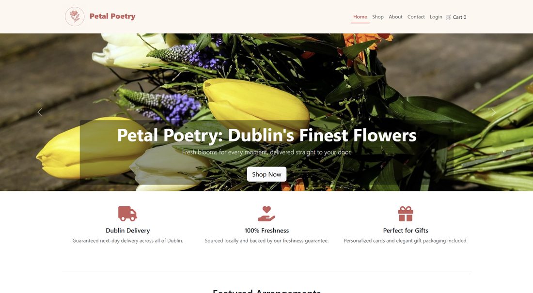 The homepage — full product catalogue, category filtering, price/name sorting, and a mock checkout with saved delivery details.
What I built
- Shop & cart — category filtering (bouquets, wedding, plants, gifts), sorting by price and name, and a cart persisted in localStorage.
- Accounts & autofill — a profile page that saves delivery details, which then auto-fills both the contact form and checkout address for a logged-in user — my own idea, and the feature I’m most proud of on this project.
- Mock checkout — a full purchase flow with hardcoded card details for demonstration, since there’s no real payment processing or backend database (products are served from a JSON file, loaded once and cached rather than read from disk per request).
- Fully responsive — progressive product grid (1 → 2 → 3 → 4 columns), a hamburger nav on mobile, and the cart summary staying sticky through checkout.
Design decisions
The palette was chosen deliberately rather than left as Bootstrap defaults: Soft Peach (#FEF7F0) for backgrounds and the navbar, Dusty Rose (#CE5E5B) as the primary brand color for buttons and headings, and Blush Pink (#DD8E8C) for hover states — romantic and elegant, but still WCAG AA compliant (4.8:1 and 5.2:1 contrast ratios). The login page uses a glassmorphism panel with backdrop blur, and the SASS is built around reusable mixins and placeholders (like a %smooth-rise hover-lift used across cards) rather than repeated one-off styles.
Performance
Lazy-loading images, compressing everything through TinyPNG (product photos went from ~2.5MB to ~200KB each), and caching the product JSON in memory instead of reading it from disk on every request took the site from 3–5 second loads and 5–8MB page weight down to 0.8–1.5 seconds and 800KB–1.2MB — roughly a 70% speed improvement and 85% size reduction.
Accessibility
Semantic HTML5 throughout (nav/main/section/article/footer), explicit label-to-input associations, aria-required and role="alert" on form validation, full keyboard navigation including Escape-to-close on modals, and visible focus states in the brand color. Lighthouse scored accessibility above 95/100, WAVE reported no critical errors, and I tested manually with macOS VoiceOver.
A decision worth knowing
I used AI assistance throughout, and it was honestly a mixed bag depending on the stage. Early on, it was genuinely useful — catching simple mistakes fast and helping me scaffold SEO tags and SASS structure I hadn’t used before. Later, once the codebase got more interconnected, it got worse than useless for debugging: when hover states on buttons were showing stray icons, AI assumed a Font Awesome conflict and tried rewriting my SASS wholesale, when the actual bug was that I’d set the icon and button to the same color by mistake — a one-line fix once I looked myself. A separate autofill bug took several hours of AI-guided rewrites before I solved it independently with one added line and three deleted ones. My takeaway: AI is a good accelerator for a simple, early-stage codebase, and a poor substitute for actually understanding your own code once it gets complex.
What I’d do differently
Time management was the real challenge — I underestimated how much the cart and checkout flow would cascade into other bugs. Given the choice again, I’d build a real backend from the start rather than relying on localStorage, and refactor the repeated route-handler logic into shared helpers earlier instead of letting it accumulate.